
Strategy & Craft
Splitting an ad budget: the 70-20-10 rule
Seventy per cent on what works, twenty on scaling, ten on experiments. The rule is old, simple, and violated in almost every account.
2 min readMay 9, 2026
Strategy & Craft
Five principles that separate amateur layout from professional. None require talent and all can be checked in a minute.
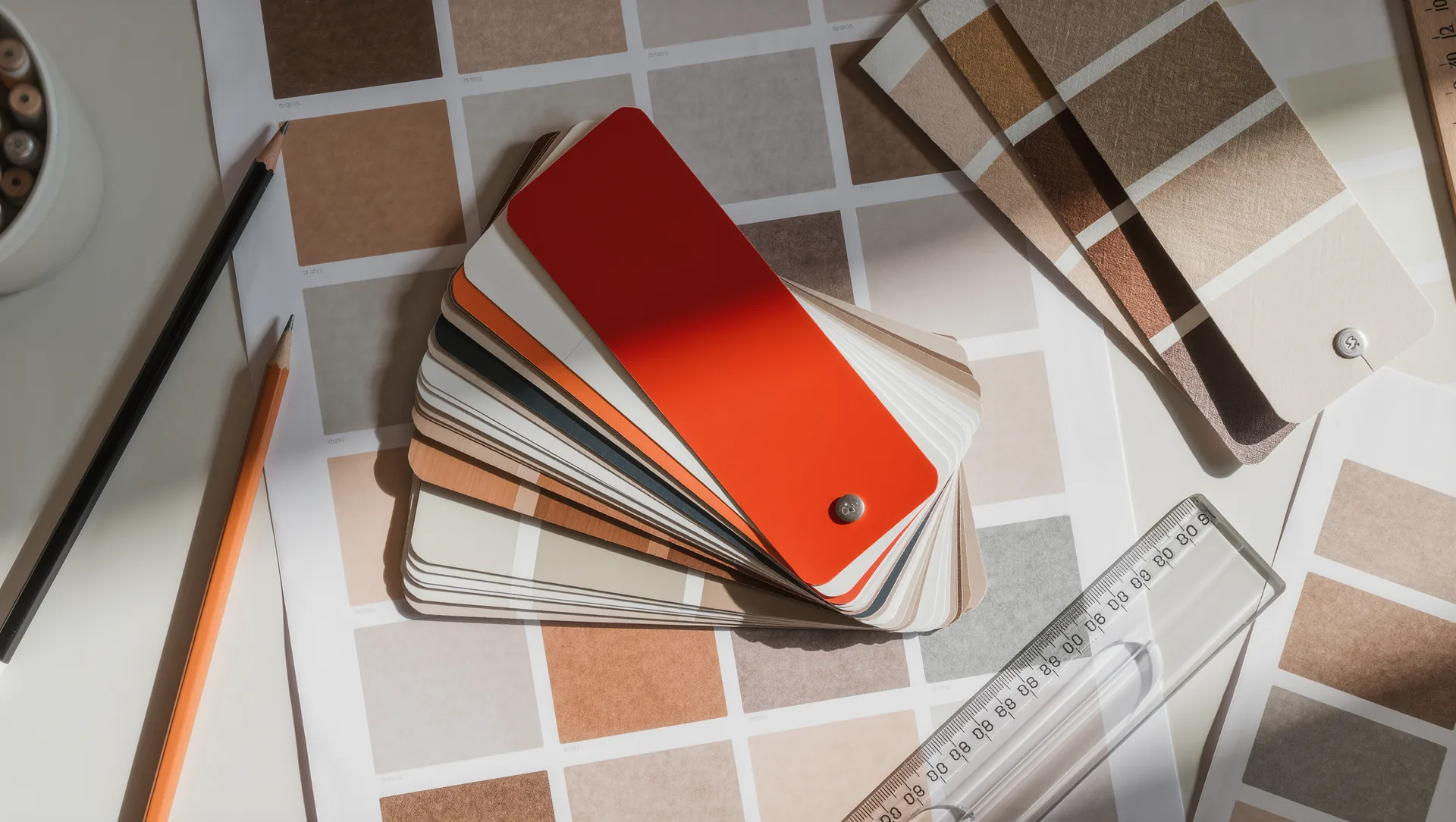
Most in-house advertising material fails for the same five reasons, all of them mechanical and all of them fixable without design training.
The instinct is to fill the page, because empty space feels wasteful when you have paid for it. The result is a layout in which nothing stands out because everything competes.
A practical rule: increase every margin by half and delete whichever element you were most reluctant to lose. The page will look more expensive immediately.
Every layout needs a clear first, second and third thing. The reader's eye should have no choice about where to start.
Achieve it with size, weight and position, in that order. A headline twice the size of the body text creates hierarchy. A headline 15 per cent larger creates ambiguity.
The test: squint at the layout until it blurs. Whatever still stands out is your hierarchy. If nothing does, there is none.
Every element should align with something else. Left edges to a common line, tops to a common line, and consistently throughout.
Centred layouts are the usual trap. Centring text looks tidy and reads slowly, because each line begins in a different place. Centre a headline if you must; never centre a paragraph.
| Combination | Result |
|---|---|
| One typeface, two weights | safe, professional |
| Two typefaces, clearly different | good, needs care |
| Three or more | almost always amateur |
If choosing two, make them obviously different: a serif with a sans-serif, not two similar sans-serifs, which reads as a mistake.
Grey text on a light grey background is a recurring failure, in print and on screen. It looks refined on a designer's monitor and is unreadable on a phone in daylight.
Body text should be near-black on near-white. Reserve low contrast for elements that genuinely do not need reading.
Before anything is printed or published:
If the answer to the last question is yes, remove it. Then ask again.
One dominant, one accent, plus neutrals. A fourth colour needs a specific reason.
Filling the space. Crowding is what makes a layout look homemade more than any other single thing.
More from Strategy & Craft
Strategy & Craft
Seventy per cent on what works, twenty on scaling, ten on experiments. The rule is old, simple, and violated in almost every account.
Strategy & Craft
Percentage-of-revenue rules are widely quoted and mostly wrong. The answer comes from your own numbers in four steps.
Strategy & Craft
A bad brief produces bad work at full price, and the client pays twice. Eight questions, two pages, three hours of your time.